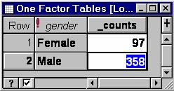
Exploration & description/Age and gender of headLet us now look at some of the homestead information that may have a bearing on the management of cattle, e.g. gender and age of the head of homestead (Question 2 in CS11Quest1). We shall present pie charts at the regional level and a bar chart at the sub-regional level; there are insufficient data to consider distributions further down the hierarchy at the dip tank level. A pie chart can be created in Excel but we shall demonstrate here how this can be done in GenStat. To create the pie chart for the distribution of gender of heads of homesteads, we first need to run the Frequency Tables option on the variable 'gender' and store the frequencies in a spreadsheet. This is done via Stats → Summary Statistics → Frequency Tables.... and clicking 'Display frequencies in spreadsheet'. This gives the frequency table:
|
![]()
![]()
![]()